Go from Jupyter Notebook to Python data app fast
Meet the Speaker

Nathan Drezner
Nathan Drezner is a Product Manager at Plotly.
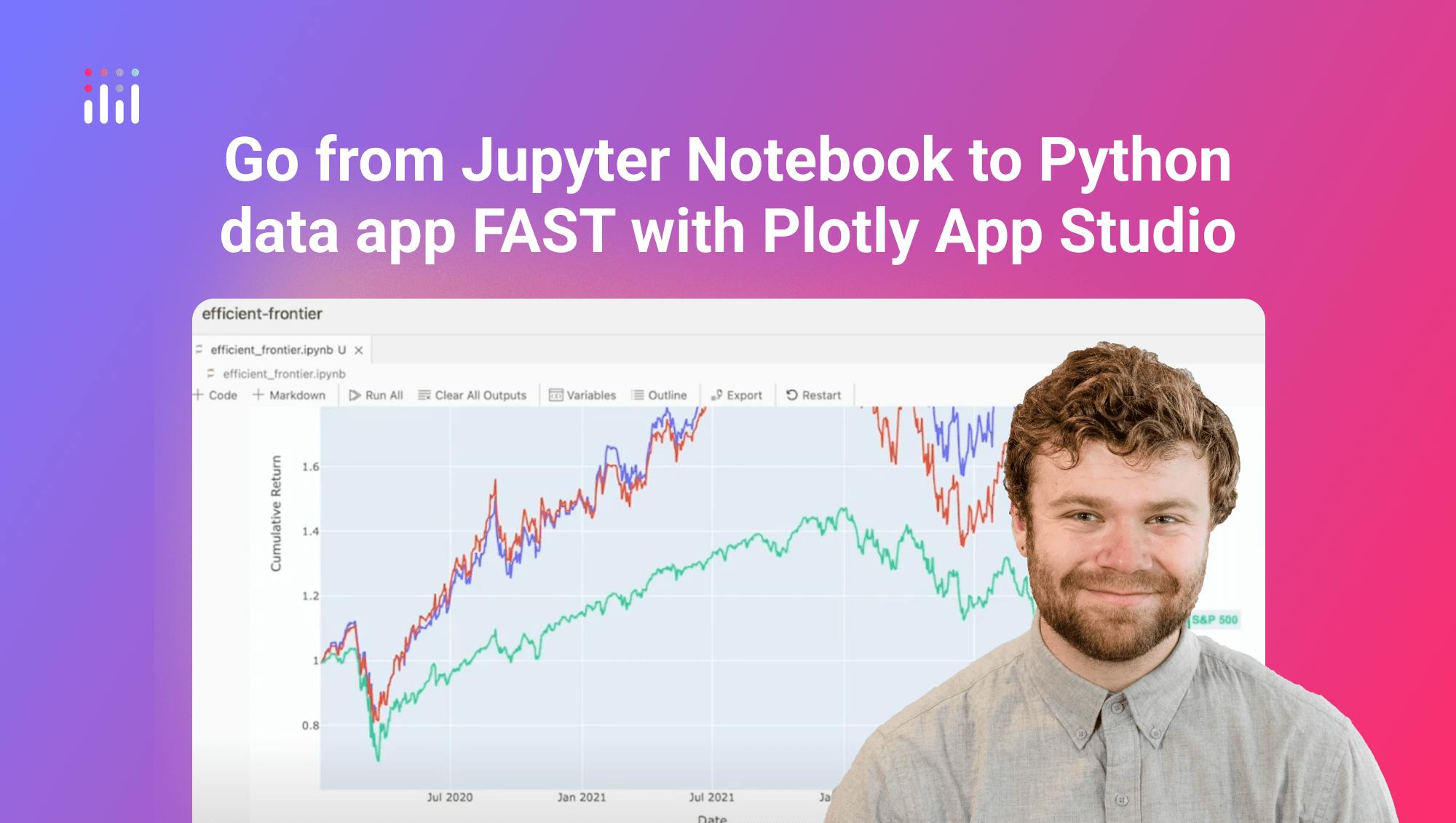
In this video, Nathan from Plotly walks through how to transform a Jupyter Notebook into a shareable Python data app using App Studio in Dash Enterprise. The example used is an efficient frontier analysis project containing data tables, simulations, and output figures.
The notebook contains a typical analysis flow with a combination of Plotly charts and Dash components. By launching the App Editor within App Studio, Nathan is able to convert this analysis into a structured, presentable application. App Studio automatically detects and imports the key components from the notebook into the app layout.
- Notebook charts and Dash components are auto-detected and arranged in the editor
- Sections can be created to group related outputs like tables and figures
- Unnecessary outputs such as interim data matrices can be hidden from the UI
- Section descriptions and layout adjustments improve readability and visual structure
Nathan reorganizes the layout by creating new sections for weights and charts, and fine-tunes the presentation by removing extra titles and spacing. Table components are positioned side by side and retain built-in interactivity like search, sort, and filter. Styling options are available but not explored in this walkthrough.
- Tables can be displayed with built-in filtering and sorting controls
- Section layout can be customized without any front-end code
- App Studio’s editor supports drag and drop interface design
- Dash components used in the notebook maintain full functionality
The final result is a static but clean and organized data app that is ready to be shared internally. The next step in the process will be to layer in interactivity, allowing users to adjust parameters and view results dynamically.
Watch the video to see how quickly you can turn a notebook into a data app using App Studio.